Friday, 11 December 2009

Finished


I have now finished my Preliminary task, now i must go onto the main task, I have enjoyed making the magazine, next time i need to work on the photos, i need to take a better photo and consider using different effects to make it more interesting. I also need to be more task oriatated and got on with tasks and give them more consideration.

Evaluation

Evaluating your Student Magazine


• In what ways does your media product use, develop or challenge forms and conventions of real media products?

My Magazine was meant for students, I looked at some Student magazines to give me some ideas for how to set up mine. My magazine has got the key ingredients to be a student Magazine, It has student themes e.g. University, Careers advice etc. It has also got Medium Shot for the picture, masthead, Strap line, Cover Lines and headline, which is great to put in the student magazine.


• How does your media product represent particular social groups?
My Magazine is for teenagers, my picture depicts students sat around a table reading magazines, this shows the magazine is for students/ teenagers, it also has teenage/student themes in the headline and cover lines, My magazine covers issues like fashion, music and film, Uni, and Careers advice, which shows this magazine is for college students.,


• What kind of media institution might distribute your media product and why?
My magazine could be distributed by the college by the student council as it is meant for college students, It could be advertised by the college to attract my target audiences.


• Who would be the audience for your media product?
Boys and girls aged between 16-19 who have got interests in music, film and Fashion. The have also got to be mature as there is vital stuff in the magazines like career opportunities and University ideas, It is magazine which is aimed at a student that is mature and willing to go far with careers and University.


• How did you attract/address your audience?
My Magazine has a large picture to attract attention to it, because you find most people get attracted when there is a large picture involved, I have also put in a punchy headline which is short and sweet to make my audience want to read on, I have also put in colourful Cover lines to really highlight what is inside the Magazine. My Headline is slanted to make it more interesting to look at, which is my plan to try to make interesting and fun.


• What have you learnt about technologies from the process of constructing this product?

Creating the magazine I have used word and publisher. I have learned how to constructed a magazine using publisher, I have learnt how to take pictures and ways to engage audience with different colours and ways the cover is set out. I have also learnt how to create and use a blog to show my plans and actions.

Tuesday, 8 December 2009

Contents Page


This is my finished contents page i am happy with the layout and colour i also think it looks quite good and with the fonts and pictures and colour it can really engage my target audience. There is no major gap i think i have used the space successfully.

Contents Page First Draft


This is my first draft, it is quite good,but it is abit cluttered, i need to make my second draft more presentable.

Now For the contents page

I have now chosen my Magazine cover it is now time to do three contents page plan drafts, I will have to consider how much colour to put in and what information, and the amount of pictures, I need to look at contents pages to give me some ideas.

Wednesday, 2 December 2009

Draft 3


I have completed my third draft, I think this is the best Magazine cover I have come up with, I am pretty sure this will be my final draft for the cover, it now looks more like a magazine cover, the text has been put on aslant to make it more interesting, also the headline is short and sweet. I think my magazine is minamal but I would rather that than it be cluttered with junk, If anyone has any ideas on how to improve drop me a comment. x

Tuesday, 1 December 2009

Draft 2


As you can see I have blown up picture, made the title bigger, now ir looks better, but there is still alot of space that could do with being used up. Maybe more colur needs to be added and maybe another picture or information.

First Draft


I have Completed my first draft, it needs to be improved, the picture needs to be blown up, and i need to make the title bigger, also the background is dull and i have to much space so I need to work on spicing up the picture to make it more interesting to atract, i need to add more colour my fist draft was a good attempt but, It does need some work to be improved. Now I need to get down to draft two.

Monday, 30 November 2009

Pictures


I have been and taken some photos, i have taken three i like the picture where all the students are looking at the camera as it engages the audience, the other two pictures are okay, but i was thinking of using one of the other pictures in my content page. See which picture you like folks as i could do with some feedback!!!!!.


The Plan


Picture Ideas

I need to think of what picture to take, I was thinking of getting a group of friends to got out by the cannon or by the castle, I need a medium close up of a group of people, maybe doing something humorous to engage and entertain my target audience, it needs to be interesting so that it does not bore the audience.


This is the layout I will use I will insert the picture where its says picture and where it says masthead I will add the name What’s Happenin’. Then I will put some cover lines in to try and attract the audience I will try to put in interesting topics including fashion, music, and film. The colour scheme I was thinking of using is orange and green. Then I need to look at magazines content pages to give me ideas to setup mine.
It must include pictures and page numbers.

Tuesday, 24 November 2009

Plan Selected, Now for the Picture

Right, I have got the plan for the front. I am using the top design. Now to decide what picture to use has anyone got any ideas ?

Monday, 23 November 2009

Which Layout ?


Hello, guys and girls :) i need your input to which of my designs would be good ? I quite like the top one but let me no, that would be much appreciated

Friday, 20 November 2009

2nd Textual Analysis


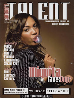
Today I have looked at the student magazine Smaart Talent. It is a student magazine aimed at Black and Minority Ethnic Students which discusses careers. The Masthead is big and bold and has a kind of 3D effect which engages the audience, it also has a shining effect this makes it look modern.
There is a medium shot of Miquita Oliver who is a well known celebrity, she is looking directly at the camera making eye contact, she looks quite cheeky as she is chewing bubblegum, which can be related to the head line, 'Miquita goes Pop' which is a pun a play on words, as she is very much involved with pop music and she used to present pop World which is humourous and entertaining.

Wednesday, 18 November 2009

Textual Analysis


Today I have looked at student magazine, first car. It is a student magazine aimed at young drivers, the Masthead is very big and bold to gain attention from the reader. The colour scheme of this magazine is simple, white, black and yellow but is eye catching to its audience.
The head line is at a slant to compliment the picture, its also lets it audience know what the cover picture is about, (the Inbetweeners are doing an interview), they are also relevant to the student mag as the show, the inbetweeners is about students so it gives the student effect, and shows what target audience the magazine is going for.
The picture depicts The Inbetweeners in a group shot, the shot is slanted to make the picture more interesting, they are all stood around an old banger of a car, which is in the show, to create humour and to give the idea of a first car which the magazine is trying to portray.

Tuesday, 17 November 2009

Questionaire- lesson 2

Here is my questionaire please may you answer it

Age:

16
17
18
19

Gender:

Male
Female


What magazines do you currently read ? :


What would you like to read about ? :

Fashion
Music
Sports
Gaming
Gossip


What is vital to put in the magazine ? :


How much would you pay for a student Magazine?

60p
£1
£2
£3


What colour schemes? :

Monday, 16 November 2009

Action Plan- First Lesson

For my media coursework project, I have been asked to create a magazine aimed at students, I have been asked to create the front cover and contents page. To guarantee I am aiming at the right target audience, I will have to think carefully about layout, colourand content.

So my action plan for my first task is to create the student Magazine cover, and content page, I have 4 weeks to complete this task. So my plan is to :

Week 1

I am going to plan the set up of my magazine and do some research into other media magazines to compare them to my own. I shall also think about font, colour, background, content and photos. I shall look at these aspects and try to fit them together to create an effective magazine, which students would purchase. I need to select a good name for the magazine, to capture my target audience.

Week 2

I am going to start creating the student magazine, primarily I am going to work on The front cover, I need to put everything together to see how it looks, and get some general feedback on how it looks and wether it has an effective vibe. I will also make sure I have selected the the correct colours, photos and fonts. I will also have a look at getting some intresting content.

Week 3

I will look at contents page and think about what is to go in my magazine, then i'll design a background and put all of the stuff in that I want. I will decide on the subjects discuss in my magazine and work on making it look professional. I will put some apropriate pictures in to portray what is going on in the magazine, this will also make the magazine more entertaining.

Week 4

Week 4 is all about finishing off making sure everything is in place and it all makes sense to its audience, I will also evaluate to make sure it is exactly how i want it to be . I will also make changes to anything that I do no like or do not think is relevant.